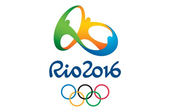
Now that the Rio 2016 Olympics are underway we thought this would be a good time to take a look at some of the design elements surrounding the Olympics. Our favorite being their logo. As design geeks we’re going to take a special look at this year’s logo.
Like most things related to design, there are a few hidden meanings buried within what seems like a fairly simple logo. Below we dive into our three favorite hidden design features of this year’s logo.
Who Designed the Logo?
First things first, who was the team behind this year’s logo design?
The bidding process for the Olympic logo was incredibly intense. Plus, the project has very high aims and goals, you not only have to represent an entire country in a logo, but you’ll also have an audience of almost the entire world. That’s a lot of people to appeal to.
The design firm Tatil was able to win the bidding war and come out on top of over 100 different design firms and agencies.
1. The Shape Mirrors the Landscape
Brazil is know for some of its natural landscape features. One of the goals the design team had in mind was to create a logo that represents more than one of their natural landmarks.
Most people already know that Sugarloaf mountain is highlighted in the logo. But, the logo also highlights other landscape features, like the mountains that surround the city, to the islands that are right off the coast, and of course the ocean.
Hold up the logo to any piece of natural scenery surrounding the city, and you’ll see that it fits beautifully.
2. The Three People Represent Change
It’s widely known that Brazil has seen and is currently undergoing massive changes from the ground up. In order for the country to move forward in a positive manner it’s going to take everyone from all walks of life coming together.
The big hug, or dance, highlights the people, the companies, and the politicians all coming together to move Rio and the entire country into the future.
3. The Emblem Actually Says Rio
Of course the logo says ‘Rio 2016’ in the letter head. But, when the logo is viewed from certain angles, the three dancing people also make out the word Rio. According to the design team, this was completely unintentional.
But, as well all know, when you’re fully immersed in a project your unconscious will add things to the design that you never knew existed, or even thought of!

The great thing about logos and most design elements is that they mean a lot of things to different people. The design team creates the best representation possible, and the people who experience the logo create their own experiences about what it means.
Finally, this is the only Olympics logo ever that was made into a 3D design, you can check it out in the image below. Looking at the 3D version will help some of the above design cues come to life.
On another note, we’ve enjoyed watching the Olympics so far, and we hope you have too.
Now over to you. What’s your favorite aspect of the Rio 2016 Olympic logo? Share your favorites in the comments below.
Written By Kevin Wood