Here at Brandamos we always love a good logo conspiracy. Now this isn’t as racy or heart pounding as the latest Dan Brown novel, but it does hit home for any of us in the digital marketing space.
Below we dive into some of the current theories surrounding the White House’s latest logo changes and overall brand identity. Keep reading, things are about to heat up!
The Story Begins
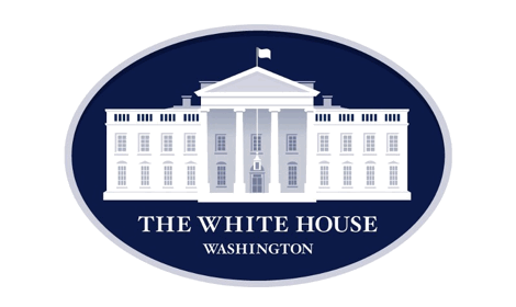
The White House logo has undergone a series of facelifts throughout the years. The story of the White House logo goes all the way back to the original printing of the $20 bill, which showcases the same view of the White House that’s used today. However, the online version of the White House logo didn’t appear until 2007.
Design Agency, Hello Monday, was called in to give their logo an overhaul back in 2009. But, when they began their initial design consult they noticed some things were awry.
The main point of contention being the arch that had somehow morphed into a pyramid in their logo.
![]()
The pyramid is a well-known conspiracy symbol and springs up in almost every single conspiracy theory related to the US and our government.
It’s hard to figure out where the arch mistake actually occurred, especially since the White House doesn’t publish anything about their logo, or their online brand. All of these changes were occurring under the radar.
Hello Monday then went on to create two different version of the logo.
The first changed the mistaken pyramid back to an arch to mirror the way the White House actually looks. The second got rid of the arches and pyramids entirely, so we could finally sweep this whole debacle under the rug. For reasons unbeknownst to us common folk, the White House decided not to move forward with the project, which left the unused logos floating around cyberspace.
Until earlier this year with the unveiling of their latest redesign.
The Latest Redesign
The latest version of the White House logo was brought into existence sometime this year. I guess the White House doesn’t care much for big brand reveals. There’s one thing you’ll notice in the latest iteration of their logo—the pyramid has been changed into an arch. Finally!
But, the alternating pyramids and arches are now all wrong. They’re in complete misalignment with the way the White House looks. But, looking back at the logos that Hello Monday introduced back in 2009, you’ll see that they’re the ones who put the error in place.
Which brings certain questions to light: did the White House lie about wanting to continue the project? Did they decide to use the original designs provided by Hello Monday? Why does the White House logo continue to have so many mistakes?
Unfortunately, this is something we’ll never quite know the full truth about.
But, it’s fun to speculate about why an institution like the White House has so many glaring errors. Are the errors intentional? Do they mean something larger than meets the eye? Is there actually a connection to the illuminati pyramids?
Now over to you. What do you think about the continuing debate over the White House logo? Is it a meaningless discussion, or is there truly something more than meets the eye? Share your thoughts in the comments below.
Written By David Shiffman
David Shiffman is Co-Founder and Brand Elevater at Brandamos. A creative strategist with over 10 years of experience developing marketing strategies and guiding business development. An expert at translating brand objectives into creative strategies. Shiffman has worked with companies such as Paramount Pictures, Universal Pictures, Absolut Vodka and Bed Bath & Beyond.. His internet marketing strategies and execution have resulted in millions of dollars in revenue for clients and his personal experience gives an advantage in elevating brands both offline and online.